Monday, 23 May 2011

Le Style Mucha

Bières de la Meuse, 1987, colour lithograph, 141 x 90cm


Alphonse Mucha moved to Paris from Czech Republic in 1887 to continue his studies whilst working as an illustrator for local advertisements and magazines. In 1985 he designed a lithograph poster for a play which was displayed though the streets of Paris which is when his style became so popular, it became known as ‘le style Mucha' and soon after given the name of Art Nouveau French for ‘new art’.
This style was used in architecture and decorative arts echoing the themes of natural elements and plant-like characteristics. Mucha often produced series of prints that echoed the elements and seasons bringing the emphasis for this style to nature.  The use of details produced through fine lines are balanced by the bold lines around the subject which is a technique still used today in comics/cartoons and illustrations. Mucha also often uses warm colours echoeing the beauty of the subject often being an elegant or goddess-like female.

Art Nouveau faded during the 20th century due to modernism but I don’t think there is an illustrator I admire more for bringing a style to life as much as him. His images are so beautiful in the detail, line, text and decorative pattern design.  Characteristics of his style are still used today and i think people should know and appreciate its origin.


Ormiston, R. Alphonse Mucha Master works (2009). London: Flame Tree Publishing

Semiotics

Semiotics is the reading of signs and codes within society and how an image can mean something else from what it actually is due to our society’s interpretation. A great philosopher named Ferdinand de Saussure stated that a sign would have a signifier and a signified.  For example the signifier would be physical form of something like the colour red, whereas the signified would be what it refers to, in this case being love or danger. However a different philosopher, Roland Barthes, stated that not all symbol and signs would be signified to have the same meaning in different cultures. For example the signifier of putting your thumbs up in the western world would be signified as ‘good’ and ‘okay’ while in some parts of the Middle East such as Iran doing this would be signified as an insult towards the other person, like how the western world have the middle finger signifier.


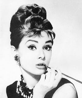
The signifier in this image is Audrey Hepburn and the signified is what is identified her with; iconic talent, musical stardom, an idol. But showing this image to someone from Africa or other parts of the world the signified would be something similar to a woman with big hair with a stick in her mouth.

Culler, J.  Saussure. (1976).Glasgow: Fontana/Collins.
Barthes, R. The Semiotic Challenge (1994), University of California Press Berkeley.

Wednesday, 18 May 2011

About Feminism...

Many people, women in particular, have always been sick of the way women are seen as lesser beings to men or as sexual objects whether it’s through film, photography, art or reality. I do agree with this, why are we regarded as being less important and knowledgeable to men? And why are women degraded so much to be presented sexually and dim-witted in film and television? Why is it always that we need saving from a macho male hero? Well, this may have been the case some years ago but I think society has moved on significantly, although, sexual representation hasn't really changed and I don’t think ever will. Unfortunately, sex sells. Not just to men though. Look at women, look at yourself and ask yourself have you ever watched something on TV  longer than you expected or stopped to take a look at a poster or photograph because you thought the male model had dashing abs? As I woman, I can admit I have and I don’t think dressing in a manly manner like some crazy feminist extremist do will stop women being represented in such a way. Not saying I approve of it; briefly hearing rap music lyrics makes me sick by the tone and language used to represent women. Physically sick. It’s disgusting.

Your body is a battleground, mixed media, by Barbara Kruger.

Barbara Kruger’s work presents her frustration with racial and gender stereotypes, religion, sex, corporate greed and power and her social, political and especially feminist irritations with society. This piece she made is for a feminist march to support legal abortions, birth control and women’s rights.


Tuesday, 17 May 2011

Keaton Henson - Weird and Wonderful

fig.1

This music video (fig.1) was made for The Japanese Popstars, directed and animated by David Wilson. The main illustrative concept designer was Keaton Henson whose work has a sense of pop art surrealism. His style is quite uncomforting and bizarre but i think it’s the cartoony approach what makes it work and look really well done.  His illustrations (fig.2) are usually quite simple yet very detailed As well as being an illustrator Henson is also a musician which is why his work goes as far as music videos and album covers. He has also design T Shirts for high street brands like top shop and I’d say his style is slightly part of this generation’s fashion.

But even I, as a youngster from this generation, think his work is a bit too much at times. Sometimes it just gets too weird and detailed you wouldn’t want to wear a graphic like that printed on your T-shirt (Fig.3/4). I suppose it’s down to personal taste but as a concept artist I really like his work. I love the way this music video portrays unusual wild imagery which is disturbing yet comical. I found this three and a half minute animation is inspiring as an illustration student.

fig.2

fig.4
fig.3

Sunday, 8 May 2011

modernism to post-modernism

Modernism had introduced a new way of living and seeing things with new technologies, social changes and art forms and focused on the idea of tomorrow rather than today. It was about being innovative and letting go of the old and embracing the new. It’s about building and changing. Waiting for the new almost speeds up life as you’re so focused on tomorrow you’re not living out your today. Post-modernism is taking something else and making it your own and working so spontaneously that it becomes hard to comprehend at times. It is something to look at with no real meaning behind it whereas modernism has a purpose and is made to do or fulfil something specifically. It is everything you use every day of your life.


This chair for instance is designed to look different and unique but it still fulfils its purpose making it a modern item.

Nan Goldin

Cookie in Tin Pan Alley, New York City, 1983

I have mixed feelings towards her. On one hand I love the way she works, I love her style and on the other I think her photography is not what she claims it to be. It’s limited to gay, sexual, or emotional subjects. Which is great don't get me wrong but to me it seems that at that time of her life there must have been typical usual things and I think she concentrated on what she knew to be different for the sake of being different even though she makes it clear that she photographs all her experiences without really thinking. I know that a lot of people wouldn't agree. But from what I've seen that's just the vibe I get.

What I love about her work though is the simple and authentic approach she has when photographing her experiences and loved ones. It feels effortless and real; the blur, the framing, the uneven flashlight all reminds you that she’s behind the camera interacting with her subject making the photograph all the more intimate. It’s quite genius really, how it draws you in, you begin to try to understand the relationship between photographer and subject. I’d say it’s a technique I myself shall be trying more often as of now for personal work.

Thursday, 28 April 2011

Jim Goldberg - Deutsche Börse Photography Prize Winner

Jim Goldberg's section of the exhibition.

I went to see the Deutsche Börse Photography Prize Exhibition on Tuesday in Baker Street.  We weren’t allowed to take pictures but my classmate sneakily took a picture of Jim Goldberg’s section posted above.  I can see why he won the prize looking at his work amongst the other nominees in the exhibition. Not to say that the other photographers weren’t as good. They were good too. Some more than others but that’s just my opinion.  What made Goldberg’s work stand out though was his experimental storytelling technique shown through his images from Polaroid’s to large and medium format cameras to video. The writing on the photographs really gets the viewer drawn into the subject which i think is simple yet effective. The fact that the person photographed has written on images themselves makes the experience even more personal which i really like. I heard someone recently say Goldberg’s work was not very original and how its has all been done before in trying to capture us by our sympathy for the subject. I suppose he’s not the first photographer to document people from strict and economically wrecked countries such as parts of Africa, Asia, the Middle East and Eastern Europe. But i think Goldberg is successful in portraying the experiences of these people having immigrated to Europe presenting their pain and suffering shown in their images and their text.. 

I suggest anyone go see the exhibition as soon as possible since its finishing this week!


Saturday, 23 April 2011

Jeff Wall

Insomnia, 1994, Transparency in lightbox, Cinematographic photograph 


Jeff Wall has been credited to have introduced the world of photography to the contemporary Art field from the early 80s.  His work appears to be documentary photography when in reality it is usually set up through actors, props, sets and thought out lighting giving him the role of director as there would be for film making. This approach is successful as it signifies the theme of tableau photography of displaying a narrative within the photograph. He also covers urban environments in his work and these themes are often presented in a size and manor a nineteenth century painting would be.
His image ‘Insomnia’ shows a set replicated to look like Jeff Wall’s kitchen in his studio. The composition is reminiscent to a renaissance painting as the angles and positioning represents the narrative.  The composition and tight clumsy positioning of the furniture suggests the man’s state of discomfort and physiological condition as well as showing signs of the characters previous interaction with the set.  
 Wall’s signature is images printed on transparencies over light boxes, it apparently was inspired by back-lit advertisements which echo his style of directing his images as are advertisements directed.  I like how his images suggest a situation and the circumstances that led it to be are based on the audience’s imagination. 

Yohji Yamamoto - Fashionably Limitless

Yohji Yamamoto, 2001-02, fall/winter ready-to-wear collection
I went to see his exhibition at the V&A this week with an old friend from London College of Fashion. It was good i have to say, i love how he never produces collections according to popular present trends and how he usually follows an avant-garde style constructing abnormal and fascinatingly weird garments that really capture your attention. His unique style often mixes old and new trends together and the use of draped black silhouettes echo throughout his collections creating a sense of surrealism. There’s no doubt about it he’s good at designing let’s say, ‘different’ garments no matter how impractical they are.
To be honest, no matter how much I admire his style. I just don’t see how anyone can be seen walking down the street wearing one of his garments without getting a few glances. I actually see his items as pieces of artwork. Something to be looked at behind a glass cage or to be photographed and exhibited. Don’t get me wrong, I love how some people really like to express themselves through what they wear totally standing out from the crowd. It’s just a sad thing that not everyone appreciates that and its designers like Yamamoto that encourages people to think outside the box because the reality is that there doesn’t seem to be much of a line between fashion and art anymore and to be frank, I like it.
The exhibition finishes in early July so i recommend anyone go see it in their free time.

Salazar, L. (ed.) (2011) Yohji Yamamoto, UK: V & A Publishing.


Wednesday, 23 March 2011

an american, The American


Parade - Hoboken, New Jersey, 1955

Having lived in switerzerland with his wealthy family at the time of WWII as a Jew fearing Nazism Robert Frank grew up feeling repressed and introverted. From a young age he was drawn to photography and design and in his 20s he immigrated to America and started working as a fashion photographer for harpers’ bazaar. He’s mainly acknowledged for his book The Americans which is noted to be the best photography book by far. It basically documents America as it was at the period. The REAL America often being harsh, tough, brutal, patriotic and honest which even covered division between class and race. The beauty of his ability depicted the harshness of reality and recording what is there, as it is, honestly, spontaneously even, without any artificial, fake aspects visible is what makes his work so iconic and what which i find so captivating. His images represent America as he experienced it as he became an American. Since it was known as ‘the land of dreams’ i love how this book is just the pure truth and nothing more as we begin to understand that period of time in that country and how those dreams were to become.

Frank, R. (1959) The Americans, New York: Grove Press

John Stezaker

Film Portrait (Incesion) V, 2005, 19.5 x 14cm, Collage


I went to see Stezaker's exhibition at the White Chapel gallery last week just before it ended. Unfortunately i wasn't able to take any pictures as we weren't allowed but thankfully a lot of his images are accessible online. I have to say, at first glance i was thinking 'is this really it?' but after walking around i actually started to like what i was seeing. I mean, they ARE just pictures layered onto each other but the way he does that fits so well both in composition and sometimes scale. The kinds of feeling you get looking at his images are a bit disturbing since there’s an element of slicing through the faces. Just the cut of layered picture made me feel like that. But it works well artistically and i actually think it looks fascinating. I especially like the fact that his work consists of vintage film stills and postcards; the idea of mixing old images to create a fresh meaning through precise juxtapositions. I’ve always been into photomontages and collages which is perhaps why i really like his style since it’s a new approach of photomontage to me.

I stumbled across this advertising campaign for a Lithuanian bookshop called Mint Vinetu which in some way reminded me of john Stezaker’s style in the idea of an image completing another image.


John Stezaker at the White Chapel Gallery

John Stezaker's Artist Profile from The Saatchi Gallery

The Fame Game


What really was a desperate attempt to get back into the market after major bankruptcy; Polaroid appointed Lady GaGa as creative director just last year. She's doing quite well for herself celebrity-wise I have to say. Pretty much everyone knows who she is and what she’s famous for (her ridiculous outfits) so i see why Polaroid was seeking a new distinctive celebrity to help promote their name and get some publicity but the thing’s she’s coming up with like camera sunglasses and portable printers. Are they really necessary?
Why would you carry a portable printer around with you? “A printer that i actually throw in my purse all the time” she says. I highly doubt that. I have read
Susan Sontag’s ‘On photography’ in a section where she states a photograph being an physical object rather than a digital format popular in our culture at the moment (such as flickr, photobucket, facebook) but I just don’t understand why you would desperately need a photograph so bad that you would need to print it the same minute you take it instead of going to a chemist or professional printer to get it done later on. It’s more of a gadget for someone with spare money like GaGa herself who would buy and use it once or twice and realise its actually pretty pointless.
As for the camera sunglasses; an interesting idea but I still don’t really see the point of it. Pretty much every phone has a camera built into it already and it just seems more convenient to use your phone as it’s easy to view, delete and edit your image. I mean, even my Nintendo DS has a camera built into it. So why pay hundreds of pounds on these photographic sunglasses?
I DO like how photography is so accessible now through phones and hand-held
 video game
consoles but i think maybe Lady GaGa’s idea of photographic sunglasses is a bit too much.


Lady Gaga and Polaroid


Polaroid Instant Mobile Printer